We recently made the switch from Sketch to Figma for creating mockups. One aspect that I really like about Figma is being able to create different states within a component that can be used when clicking through the screens. This helps clients see what different interactions will look like and bring the mockups to life. In this article, I'm going to go through the steps for creating an interactive button with a hover state.
First, you'll want to create your button. It doesn't have to be too fancy since this can be updated later in the component.

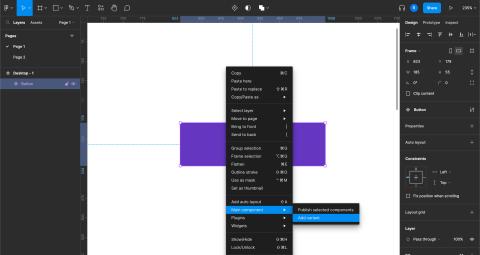
Once you have your primary button created, select it and click on the diamond-shaped icon in the top bar to create a component. Right click on the component and click on Add variant under the Main component tab.

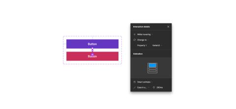
This creates a duplicate of your component and double clicking on it will allow you to style it to act as a hover state. Once you have your styles ready we can add the functionality for hovering over the button. Under the Prototype tab add a new interaction. We want to set this interaction to "while hovering, change to [variant name]". Once this is set we can start adding this to our mockups.

When previewing your mockups you should be able to hover over the buttons and see the hover interaction. You can make this more complex by adding an outline or arrow. This same structure can be followed for creating other interactive elements like forms and checkboxes.
Need a fresh perspective on a tough project?
Let’s talk about how RDG can help.
