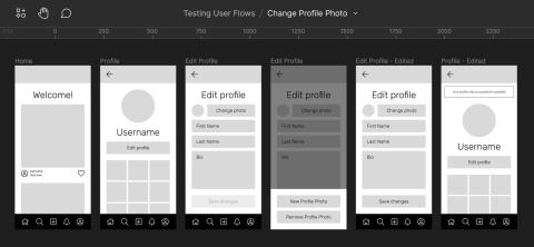
Testing early and often is helpful when designing new features because it allows your team to catch and correct pain points before spending time developing a finished product. Luckily, Figma makes it easy to create and run simple tests on user flows and interactions. Here's a quick step-by-step on how we do it here at Rapid Development Group.
Identify the task you’d like your users to accomplish
Before you start creating screens in Figma, it's best to list out the specific tasks that you’d like to test. These can range from small tasks like signing into an account to larger, more involved tasks like onboarding a new user account. When you take the time to identify the important things that you'd like to test, you narrow down the amount of screens that you will have to make. You can also prioritize what should be designed and tested first, leaving lower-priority items for later.
Map the steps that the user takes to accomplish the task (put yourself in your user’s shoes)
Once you've identified the task(s) that you want to test, try to map out the steps that you believe the user should take in order to accomplish that task. Don't just do what makes sense to you — try to empathize with your intended users and imagine what they might be thinking. Some questions you may want to ask yourself include:
- Have they used this product before, or is this new to them?
- Are they tech-savvy, or are they overwhelmed by new technology?
- What device(s) are they likely to be using?
- Are there established patterns that I can utilize to make things easier? (Don't reinvent the wheel!)
You can map the "flow" of steps in a FigJam file in Figma, a whiteboard or pen and paper, or anything in between. All that matters is that you can keep it and continue to reference it throughout your design process.

Create screens for each step in the flow
For each step that you identified, create a wireframe. When testing new features and ideas, low-fidelity wireframes are a great choice because they can be created quickly and they prevent users from focusing on unimportant details like colors and fonts. However, there are cases where high-fidelity mockups may be better, like testing whether a certain visual design performs better over another. Choose what’s right for you in your unique situation!

Create interactions to link each screen together
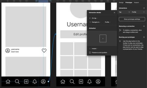
Once you've finished designing your wireframes, switch to Prototype mode by clicking on the "Prototype" tab at the top right of the Figma window. Start from the first screen in the flow and hover over the element that will act as the trigger to your next screen (usually a button). Click and drag from the small circle at the right of your element. While dragging, you'll notice an arrow following your cursor. Attach this arrow by releasing your mouse on the next screen in the flow. You've just created your first basic interaction!
By default, clicking your trigger will instantaneously open the next screen, but you can customize this behavior based on your needs. You can change the behavior (click, hover, drag, etc.) and the reaction (new screen, open overlay, scroll to element, etc.) in the "Interaction Details" panel.
Continue this process until you've linked together each screen in your flow. Once complete, it can be helpful to give your flow a descriptive name, especially if you’re testing more than one user flow within the same Figma file. Double click "Flow 1" in the right sidebar in Prototype mode and give it a new name.

Run your test with a small sample of users
Running a usability test is a whole other topic in itself, so we won't get into the nitty gritty details. Instead, we'll discuss how to present your screens and allow your users to interact with your prototype.
When you hover over each Flow in the Prototype sidebar, you’ll see a "Play" button. Clicking this button opens your wireframes in a new window free of the busy Figma UI. This is where you and your users can click through and test the interactions you've created. If you're performing the tests remotely, you can also share a link to your clickable prototype. Give the user a list of tasks you'd like them to accomplish, and set them loose!
When running a test, it’s best to avoid leading your users to finding the "right way" to achieve the tasks you give them. Allow them to figure things out on their own, and encourage them to speak their thought process out loud. Note down any pain points that they seem to be experiencing, whether they’ve explicitly stated them or not. Sometimes it's easy to tell when someone is stuck or frustrated!
Revise screens/flow based on observations
Take a look at the notes you took while observing the user tests and identify what can be done to alleviate any pain points. Revise your screens, or reimagine the entire flow if necessary! The insights that you've gained while watching others use the product you designed will help you create something that is not only usable, but enjoyable!
Need a fresh perspective on a tough project?
Let’s talk about how RDG can help.
