DesignOps is a fancy buzzword that refers to the optimization of processes, systems, and workflows with the goal of increasing efficiency and maximizing value within design teams.“DesignOps is everything but actual design,” says Meredith Black, a DesignOps pioneer who literally wrote The DesignOps Handbook.
While there are many different aspects of DesignOps, one of the biggest and most tangible pieces of the puzzle is creating a design system. Design systems allow teams to quickly create designs and ensure that those designs remain consistent over time. At Figma’s Config 2023 conference, many, if not all, of the DesignOps sessions referenced the use of design systems as a key component to success.
It makes perfect sense that having a system of reusable components would speed up the design process for individual brands. But what about agencies? How can a reusable set of components created with one brand in mind possibly work for a company that works with many brands with unique design needs? This question has been haunting me for as long as I’ve known about DesignOps.
The big idea
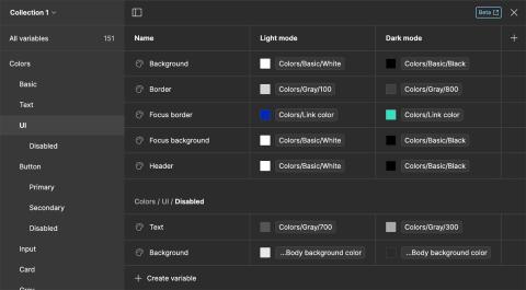
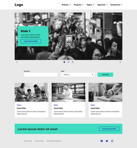
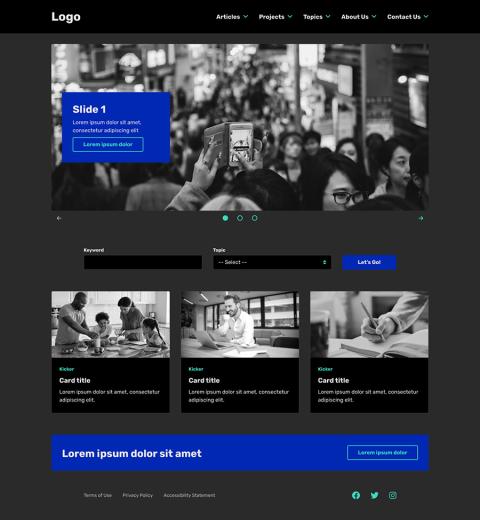
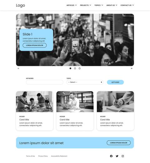
While watching a deep dive training on the power of variables within Figma prototypes, I suddenly had an idea. If I could leverage the variables system to bind branding choices to common UI components, then I could create a Figma template that could be duplicated and modified for each new design client. No sooner had the thought crossed my mind than I created the template to begin experimenting.
Setting up
Before I got started, I wrote a list of everything that I wanted to include in the template. This allowed me to have a bit of a game plan before just diving in without any direction. The list included things like typography styles (H1, H2, etc.), button variants, form elements, cards, accordions, sliders, etc. Once I had a list of components that I wanted to include, I had a good idea of the types of variables that I would need to add to my file in order to be able to control the design of all of these components in one place.
Setting variables
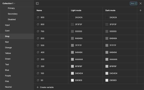
One of the first things that I did was create a few basic variables for things that I knew would be reused many times within a Figma file. These basic variables included things like color values, gutters, and border radiuses, among many others.

