Not everyone uses a mouse to navigate the web or relies on their phones with touch and gestures. There are many people that have issues with color blindness, low vision, or even perfect sight combined with a motor impairment that prevents them from using a traditional mouse or trackpad. For people like this, having a clearly visible focus style is imperative to help them know where they are on a web page. WCAG 2.2, which is due to be released this summer, amplifies previous focus visible guidelines, marking them the highest level of importance (level A) and adding focus appearance guidelines to help ensure the focus style appears in high enough contrast with both its element and the background.
So how can we address this? First and foremost, do not do this:
// I repeat, DO NOT DO THIS
*:focus {
  appearance: none;
}
This was common practice for a while, and sadly still is for many, for those that don't like the various types of ugly focus rings that browsers implement as a default focus style. However, this makes it impossible for people to see which element is in focus on the screen, which makes for a terrible user experience. Instead, let's rejoice in the fact that we get to take this opportunity to extend our brand in a fun way by coming up with unique and interesting ways to differentiate between element states.
For those of us that don't like how focus styles can get applied to clicked elements (ex. those pesky <button> elements) and the lack of widespread support for :focus-visible, we can implement a polyfill such as focus-visible. This will help detect when a user is interacting via keyboard, and give us a helpful class to style elements when focused via keyboard, but not when clicked.
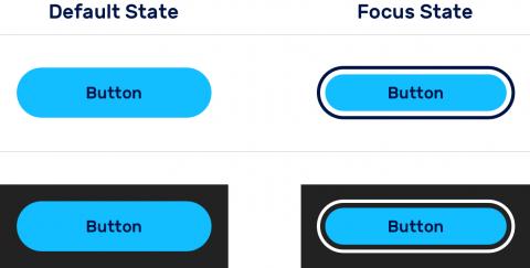
Here's an example of how hover and focus states can look different for a button element, depending on the background:

As you can see, the color of the focus ring is different depending on the background, ensuring appropriate contrast.
Takeaway
Don't think about focus styles as something to be disabled or tolerated. Use them as an extension of your brand while keeping their core purpose in mind. If you want better control over when they appear, consider a polyfill to help you target focus styles that appear by keyboard navigation only.
Need a fresh perspective on a tough project?
Let’s talk about how RDG can help.
