Project Expertise
Migrations & upgrades
To ensure a seamless upgrade, we migrated all content from the legacy system to the new platform. This included everything from video lesson content to user accounts and training data, allowing the new system to support their existing user base without disruption.
Modern web applications
The original RSA was stitched together using several out-of-the-box services, many of which fell short of WhizBang! Retail Training’s specific needs. The custom application we developed replaced this patchwork with a streamlined solution, eliminating unnecessary features and tailoring the platform precisely to their requirements.
Project Contributors

Mike Bopp
Senior Developer

Haley Troyer
UX Designer
Project Brief
WhizBang! Retail Training was in need of a new learning management system (LMS) to replace the off-the-shelf service they had used for many years. Their goal was to build something that was easier to use, had a modern design that reflected their brand, and could scale with them as they continued to grow both subscribers and training content. Because this was such a large and complex project, we conduced an extensive project discovery phase to identify the core features that were essential in order to deliver a positive user experience. These features included:
- A highly-customized experience based around the user's role and subscription type
- A sophisticated course creator that allows not only administrators but also subscribers to create their own custom training materials.
- The ability for users to be assigned training, watch lessons, take quizzes, and earn certifications (and for managers to track their team's progress)


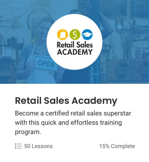
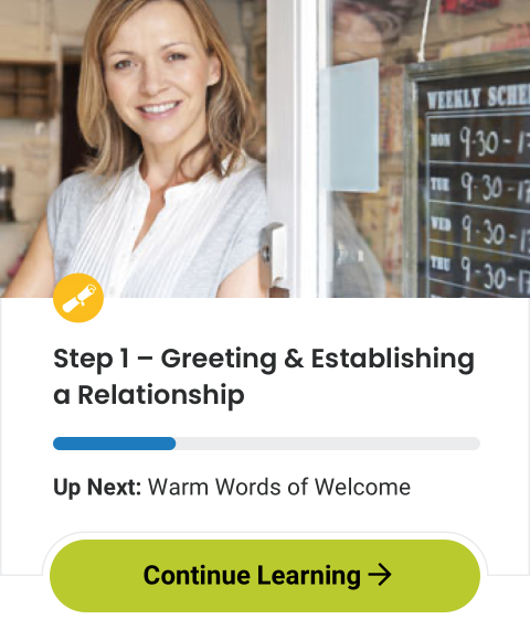
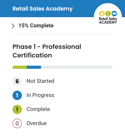
The dashboard before and after the redesign. Our goal was to remove unused options and only present what was necessary to the user.
Discovery Phase
Because of the size and complexity of the project (with many different user types and third party service integrations), we started with a comprehensive discovery and strategic planning effort. The object of this discovery phase was to clearly define needed functionality from the legacy LMS, as well as new and re-envisioned features to enhance the user experience. We vetted the proposed technology stack, defined the target audience and identified each user's specific needs. Based on this information, we defined the minimum viable product, and then created wireframes for the app based on that scope.
Challenge
Representing many different user types
Solution
Creating user stories centered around each user type
Challenge
Integrating needed third-party services and apps
Solution
Creating a diagram of services and integrations

User stories
We created user stories for four unique user scenarios to ensure that our app satisfied the needs of each person using it:

Employee
Employees are the most basic user type. The employee's main goal is to watch training videos, complete quizzes, and earn certifications.

Manager
Managers oversee the training of individual employees. The manager's goals are to complete their own training and to ensure their employees are on track with theirs.

Owner
An owner is the economic buyer of the LMS. The owner's main concerns with the app is account management and billing. They may have several stores and store managers under their purview.

Admin
Admins are the app's administrators. The admin's main goal is to manage courses offered within the app, handle subscriptions, and resolve support requests submitted by the app's end users.
Technical Requirements
We knew we needed the basic building blocks of most applications: A database to persist data, a scalable back-end that can be adjusted to match usage, and a front-end that was flexible, modern, responsive, intuitive, and easy to use.
We chose to use Symfony as our framework for building the API for the back end. Symfony shares a lot in common with the Drupal CMS with which we are very familiar, but it allows us to focus development effort and server resources toward the only part we needed - the business logic to facilitate communication between the front-end and database.
On the front end, we chose to use the Next.js framework, built on the popular and familiar React.js infrastructure. Next.js provided the developer experience and tooling needed to build out a large site with a large hierarchy of pages, but also provided configurable server-side rendering, which would give us a lot of options when it comes to tuning the performance of the site.
Most training content is in the form of videos, so we needed a robust and reliable way to save and stream these videos on a variety of devices. We knew it would be most cost-effective to leverage a robust, proven service to handle this functionality. We evaluated many prominent providers and ultimately selected Wistia because of its customizable video playing experience. Customization is particularly important for this site as the videos needed to be interactive, prompting input from the user during playback that determined the content best suited to each user.
For sending email, we chose to use Sendgrid, which we have used on most of our projects. And for SMS delivery, we chose Twilio for its developer support and overall reputation in the industry.

Wireframes
After settling on a desired technical stack and individual user stories, we created basic wireframes that helped visualize the way the app would flow from screen to screen within each specified scenario. These wireframes helped us communicate our ideas to the client without getting hung up on any visual design decisions. We worked with the client to tweak the wireframes to ensure that each user flow was streamlined and intuitive.


We started by wireframing several key user flows, including completing a lesson and quiz.
Design Phase
After an extended discovery phase, we felt confident transitioning into the design phase. Knowing that all of the strategic and architectural decisions had been solidified, we were able to fully focus on the visual aesthetic without distraction.
Challenge
Design needed to be upgraded while still matching the client's brand
Solution
Delivered three unique design concepts, followed by a review/iteration phase
Challenge
Large amount of screens to organize
Solution
Utilized shared styles and components whenever possible
Challenge
Delivering a large number of mockups
Solution
Creating an interactive prototype using Invision


We designed many components that could be reused throughout the app, from banners, to cards and charts.
Development Phase
By splitting the development of this project into two primary technologies, we could work on both in parallel with different team members focusing their attention to each. But in order for this to work well, we needed to establish the basics for how the front-end and back-end would communicate with one another. Assumptions would need to be made on both sides in order to limit the number of dependencies between the two.
Challenge
Efficient development of the API and user experience in parallel
Solution
Use GraphQL to define how the server and client would communicate
Challenge
Maintaining fast performance despite highly-customized experience
Solution
Using the Next.js Framework
Challenge
An existing platform with thousands of paying users that need to be transitioned to new application
Solution
Develop a suite of migration utilities
We created a migration plan that paced the transfer of subscribers in definable batches from the old system rather than doing it all in one big process. This served two important purposes:
• During the development phase, we could focus on a representative subset of users to migrate and test rather than needing to transfer everything, every time.
• During the final account migration, we could coordinate a dedicated transition period with account owners to manage expectations. This allowed us to work out issues incrementally rather than introduce a stressful situation where the entire subscriber base needed assistance at once.
"Great people, great project. Fun, professional, smart, and creative, Rapid Development Group has consistently come up with innovative technical solutions to ensure the success of our complex platform. They have been very responsive to our requests and ideas. As we begin the phase 2 expansion of the Retail Training Academy, we are glad to have them on our team!"


