Project Expertise
Content-managed websites
This website was built to replace an outdated site, and ensure that content managers can add new content and make updates with ease. This was a big improvement to the overall admin experience.
Project Contributors

Frank Holub
Developer

Riley Rittenhouse
UX Designer, Front-end Developer
Project Brief
RDG was tasked with building a new Drupal 9 website for the Holland Hospital Bone & Joint Center that provided a better user experience. Their old website was outdated and felt disconnected from the new Holland Hospital branding. Our main goals were to:
- Update the overall design to be more modern and better align with the Holland Hospital branding.
- Create a better user experience by simplifying navigation, eliminating unnecessary content and taking a mobile-friendly approach. We also wanted to provide an easier content administration process for future updates and basic maintenance of the site.
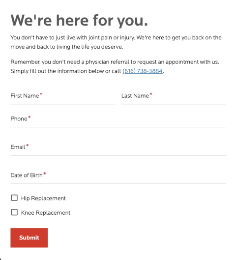
- Simplify the process for patients needing to request an appointment, download documents and access the patient portal. Follow accessibility best practices to make an inclusive experience for all users.
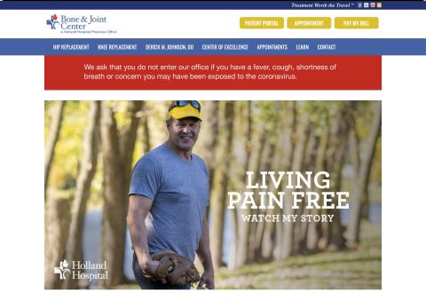
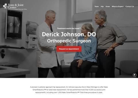
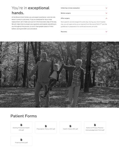
An outdated and text heavy site was redesigned to be a clean, more modern site.
Challenges and Solutions
Throughout the course of this project, there were several challenges we needed to overcome in order to create a high-quality website that achieved the client's goals.
Challenge
Working within the Holland Hospital branding, while still creating a unique design
Solution
Finding balance
Challenge
Content that was very image heavy which increased page load times
Solution
Responsive image styles
Before and After
The previous website had many elements and large images competing for attention, as well as some accessibility issues, specifically with color contrast. The client wanted their new website to have a more sleek and elegant feel, so we used lots of black and white images with pops of color to direct user's attention to action items like scheduling an appointment.
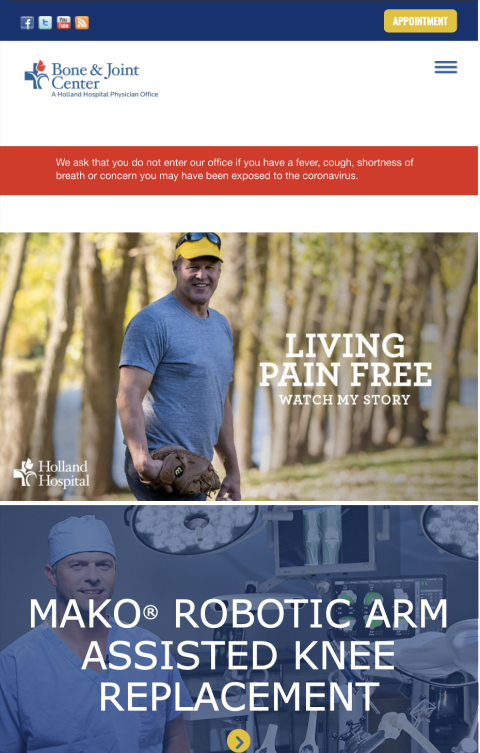
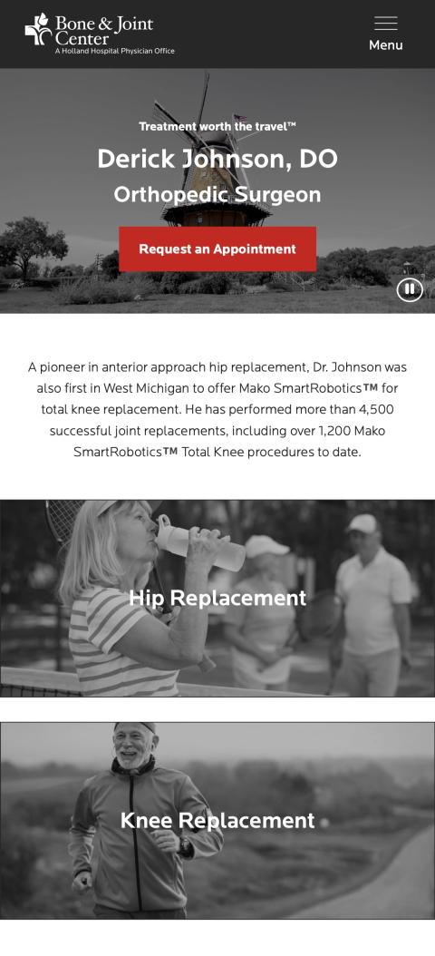
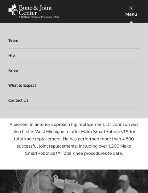
Simplifying the navigation, using Critical CSS and utilizing responsive layouts helped improve the mobile experience.
Rapid Development Group saw our vision for a new Bone & Joint Center website and thoroughly executed the project. Their team was quick to respond, meet deadlines, provide creative web solutions, and design elements for a more user-friendly website. Working with Rapid Development Group made the process seamless.


