Project Expertise
Modern web applications
With this solution, we enabled a variety of audiences access resources seamlessly on both mobile and desktop devices. By leveraging Drupal, we were able to build a similar admin experience to other WETA sites, allowing them to easily update and manage content on their own.
Project Contributors

Jonathan Chaffer
Senior Developer

Haley Troyer
UX Lead, Front-end Developer

Riley Rittenhouse
UX Designer
Project Brief
Our client, WETA Learning Media, wanted to create a resource to give new teachers of English Language Learners a user-friendly entry into some of the most popular and helpful content from their well-established website Colorín Colorado. This streamlined user experience would allow users to find and share individual resources, which include articles, videos, and downloadable files, and view collections of resources around particular teaching strategies. There were a few requirements that led us to design and build a progressive web app, including:
- The ability to quickly access the content by downloading a bookmark or installing the web app to the user's chosen device
- The ability to access articles, videos, and text content even without a good internet connection
- The ability to share content via text, email, and other apps on the user's device (i.e. social media applications)
Discovery
After an initial kickoff meeting with the Colorín Colorado team, we began trying to empathize with the target audience by creating user stories and journey maps to highlight the key functions of the web app. We then used these stories to inform our layout choices once we moved to creating wireframes. These early exercises not only helped us to prioritize what features we needed to focus on, but they also helped the client streamline their vision and decide what they truly wanted from the resource. During the entire discovery phase, we kept in close contact with our client to ensure we delivered a product that not only functioned but delighted.
"I want to learn about a specific topic"

Design
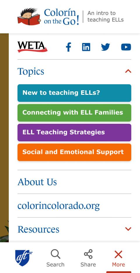
Colorín Colorado had a very well-defined brand that included many assets, including beautiful watercolor illustrations by Rafael López, that we were able to use to create designs that brought the experience to life. Through our visual choices, we made sure that the web app could be clearly identified as an extension of the main Colorín Colorado website without looking like a carbon copy. The client stressed the importance of color and a fun, friendly look and feel, so we used color as a primary tool in differentiating between the four primary topics that categorize all content within the web app.


Development
To deliver this content to the broadest possible audience, we chose to build a mobile-first web application rather than individual native applications for iOS and Android platforms. This not only reduced development costs and future maintenance, but ensured that we could support desktop users as well even if this was not the primary audience.
With this strategy established, we began by setting up a modern website in the Drupal framework already well-established for the parent site. Content types and taxonomy vocabularies flowed naturally from the requirements, and content work could begin while we addressed the remaining technical challenges of this hybrid approach.
Challenge
Viewing content from another website within the app
Solution
A curated syndication system
Challenge
Prompting users to install the app to a variety of supported devices
Solution
Layered fallbacks for device feature sets
Their design and UX ideas made the project shine, and their willingness to collaborate closely and work through numerous edits and iterations in the mock-ups resulted in a product that is both easy to use and visually appealing. Our partners and audience have been extremely enthusiastic about Colorín on the Go, and we are so grateful to RDG for their exceptional work on this unique project!


